Sunday, 15 February 2009
Friday, 13 February 2009
Evaluation
1.What skills have you developed through this module and how effectively do you think you have applied them?
This module has been a real struggle but it has been extremely rewarding. I have been able to achieve a final outcome, which I previously would of never been able to attempt and considered far too advance and beyond me, so because of this I am very proud of my final piece and what I have achieved.
Adobe after effects was new to me from the start when we fist had our workshops in them at the beginning of the module, I made sure specifically to record notes so I could always come back to them at a later date and this helped me and as a result I felt much more confident to work on my own.
I now feel very confident with using After Effects and experimenting with in it. I have learnt the majority of this through trail and error and persisting. By the end of this project I had developed a list of keyboard shortcuts, which I did not know before, so I will now be able to use them in future, project to save time.
Above all what I have learnt with this project is that organisation is essential and should come as a priority when designing for on screen. By the end of this module I was doing my best to keep everything organised and it paid off as uploading my work to the DVD and publishing my I web worked smoothly and quickly.
2. What approaches to generating work and solutions to problems have you developed and how have they helped?
What I learnt from the past module and I took into great consideration in this, was do not leave things to the last minuet to do all at once no matter how big or small they are. By starting earlier it enabled me to exploit ideas more than I would have been able to do before and experiment on screen with the time saved.
Again from the last module I did not back up my work and a s a result lost some of my key pieces and I had to quickly rush and do them again. Everyday with this project when starting the animation I backed up on three different devices, reassuring that if one was lost I would still be able to access my work without the stress or pressure.
As I have said above organization is key and has been throughout this project. I learnt more about this at the end as I was very conscious and aware that if files were not labeled and organized files could easily be lost and it would waste time and prevent a smooth finish.
3. What strengths can you identify in your work and how have/will you capitalize on these?
I really feel I have made this project work for me, I have been able to incorporate my own style with in it successfully and I think this is why I have personally enjoyed this project so much. This has been the first module, which has really engaged me, and I have wanted to successes and do well and push myself.
A strength would be the format and the layout/ style I have used within my piece – as it is consistent throughout and clearly distinguishably mine from own style of working.
I particularly like the first opening pages of my I web, if I had not run out of time I would of taken these further stylized each page to be my own and fit in more with the overall feel of the animation.
I found I web a very useful piece of software, and very simple and easy to navigate your way around once you know how. From this I will be taking these skills forward and be designing my portfolio on it ready to send out to possible work placements within the next few weeks. Similarly with After Effects, I am not thinking of writing my cover letter on it, making it interactive and engaging.
4. What weaknesses can you identify in your work and how could you exploit these more fully?
I thought my storyboards overall were very weak. I am not of yet a very good drawer but I think I could of put more of an effort into designing the final storyboard with color and the celebrity’s better. However I drew them in a simplistic style which I can make sense of, so they were not wasted when I was designing on After Effects, but I just do not think that other people would be able to make sense of them.
I could and should of developed the salon backdrop more, for example using my own photographs of salons to cut and paste the backdrop instead of using ones from magazines and the Internet.
Again organization is one of my biggest weakness an s a designer, it lets me down as it loses me time. I do feel I have improved enormously compared to the last module and I feel a lot more positive, but there is still always room for more improvement.
5. Identify five things that you will do different next time and what do you expect to gain from doing these?
I would again increase my research skills and start from the day we are given the next brief instead of having a week to think and take it in.
Make sure I keep on backing all of my work which I design on screen. This has benefited me so much and I must keep it up at all times in the future.
Again keep up to date with organising my files from the start, so I know exactly where everything is and i do not waste time in trying to find and relocate file when I am busy.
i would like ot continue to use Adobe After effects to my advantage. i found ti a very easy programme to use once you know the basics and it is so rewarding to see what you can achieve, as i never thought I would be able to do anything like this before. From this, my skills can only grow and as a result i will become faster and faster.
Next time I will try take more time spent on development my ideas and revolving them and fully exploiting them to the best of my potential. This will results in pushing myself further and discovering new style which i could use in future projects.
6. Identify five things that you will do different next time and what do you expect to gain from doing these?
1)Attendance - 4
2)Punctuality - 4
3)Motivation - 5
4)Commitment - 4
5)Quanity of work prodcueed 3
6)Quality of work 3
Contribution to the group -3
Monday, 2 February 2009
Type of illistration/mixed media formats
This is the intro for MTV's Girls of the Playboy Manson. The programme is about Hugh Hefner and his 'girls'. The style is very cut and paste, slow, jerky movements to emphasise possiaby the stupiddity of the 'girls', as all of them are your stereotypical blond bimbos. I think this would be very effective style to use whiting my animation as it ridiculous the celebrity's and belittles them.
New cadburys advert, made me laugh!
This advert really caught my eye, it is very simply framed and looks clean ad crisp in its presentation. ar first I though the two children could be making the expressions on there own, but then as the pace increased it is defiantly imposable and each single expression has been sped up and pasted onto the child in time with the music. very simple yet clever/memorable advert yet again from Cadburys.
.Quientin Blake
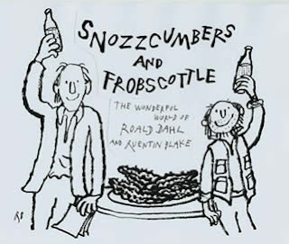
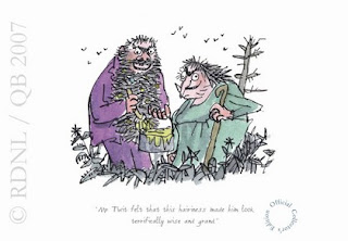
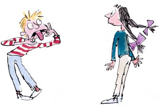
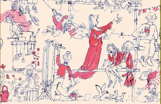
I adored the illustrations in the Roald Dahl books when I was little, they were simple black and white line drawings sometimes filled in with crayon effects, yet they had a slightly ridged feel to them. This is the style which I like to use, it is not realistic and would work well outlining my celebrity's. By drawing there bodies in this rigid way, it would go again all of what they are proud of eg, there toned muscular fit bodies and making them all become one and fit into a singular morphed body type. Experiment with this.


David Shrigley
Subscribe to:
Comments (Atom)


